Your Content Management Strategy Can Save Lives

My headline is an exaggeration, but only a slight one. Bear with me:

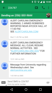
Last night at about 11PM there were two armed robberies on campus in quick succession. (Nobody was hurt, thankfully!) UNC has an elaborate campus alert system called Alert Carolina designed for just such an occasion. The sirens went off as intended. The accompanying email and text message blast did not.

It wasn’t until 11:45PM that a message with details was finally sent, by which point the crisis was essentially over. The All Clear siren sounded at midnight. (The Daily Tar Heel has a more complete timeline)

Text messages sent by Alert Carolina. Note the incorrect URL in the topmost message.

Text messages sent by Alert Carolina. Note the incorrect URL in the topmost message.

But here’s what is, from the perspective of my work, extra shameful: even when that text message finally went out, it had the wrong URL listed for more information. Instead of alertcarolina.unc.edu, it pointed to alertcarolina.com. That .com is held by a domain squatter, and helpfully offers hotel deals. While follow-up messages had the correct URL, none of them acknowledged the initial error. In fact, even the official statement about the delayed message still doesn’t mention the incorrect URL.

So what can we learn from this? While I have great sympathy for staff who work what I assume is likely a finicky but powerful piece of software like Alert Carolina, why didn’t they have a clear content management strategy in place for an event like this? The official statement calls this a “breakdown in communication”, but doesn’t elaborate. While an unpredictable event like this can only be planned for so much, it would be easy to build in simple structures in advance to help manage a crisis:

  • Have content templates ready to go for emergency updates. This would avoid the incorrect URL problem while still allowing flexibility to communicate as needed. At UNC Libraries we have templates ready to go for when we quickly close due to weather, for example.
  • Have clearly written backup procedures for when a mission critical system fails. These should cover both technical and personnel issues. There are countless campus listservs that could have been used to send a backup notification during those 45 minutes, for example. Or (I’m speculating) maybe nobody was at work who knew how to trigger the alert messages. Staffing redundancy should be built in for something at this level of importance. Build sanity checks into your procedures too, defined review points where someone looks to see if everything’s on course.
  • If something does go wrong, immediately be transparent and open about what happened and what you’ll do to fix it. The vague “breakdown in communication” acknowledgement is not sufficient in this case. Right now I don’t trust Alert Carolina to function in the next emergency situation.

Most of this can be boiled down to: Know who is responsible for which content, and prepare for as many eventualities as you can in advance. “Content strategy plans for the creation, publication, and governance of useful, usable content.” That’s it in a nutshell, and in this case Alert Carolina unfortunately makes for a great case study.

I’m lucky – the content I deal with on a daily basis isn’t a life and death matter. But that doesn’t mean I can’t have the same level of readiness, at least on a basic level.

Usability testing with Optimal Workshop

ow_logoUsability testing is one of the best parts of my job. I love hearing from users about how they interact with the library’s website and then figuring out what we can change to better meet their needs.

The dark side of this testing is the sheer time involved. Recruiting, scheduling, and sitting down with each individual user can be a daunting commitment of staff hours. I’ll say upfront: that type of testing is still great! It definitely has a place. But we’ve started using a tool that lets us run more tests, more often: Optimal Workshop.

One important bit: While Optimal Workshop has a free plan, you’ll get the most out of it if you spring for the paid level. It’s on the pricey side, but keep in mind that they offer a 50% discount to educational customers.

What we did

We used two of the suite’s three tools in a study earlier this year: Chalkmark and Optimal Sort. We advertised the tests with a pop-up on our homepage that was displayed to half our visitors. All respondents were able to enter a drawing for a $50 Amazon gift card at the end. We expected to run the tests for at least two weeks to get enough responses. But after just a week we had more than 500 and were able to conclude it early. That number exceeded my wildest expectations! Here’s how we used each tool:

Chalkmark

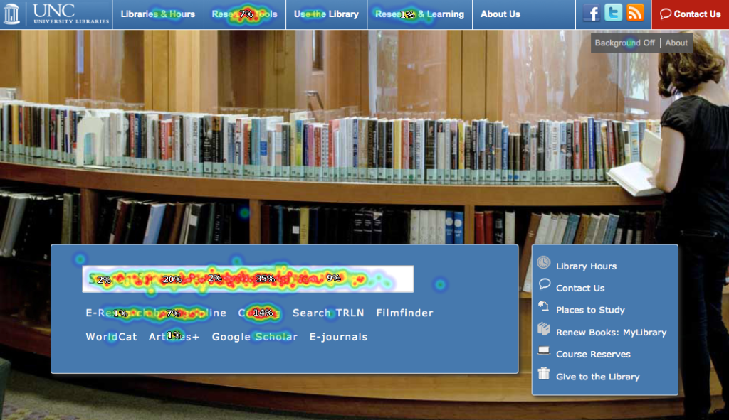
Think of Chalkmark as a first-click test. You display a screenshot or design draft to your users, and ask them where they’d click first to accomplish a given task. Results are displayed in a heatmap that’s easy to parse at a glance. For example, we asked users where they’d click first to search for a book on our homepage:

Click for larger view

Click for larger view

82% of clicks were either in our main search box or on the link to our catalog. That’s great! They were able to find their way to a book search easily. Another 7% clicked on our Research Tools menu. While that’s not ideal, it’s also not a bad option; they’ll see a page with a link to the catalog next. That leaves about 11% of our users who went astray. Thanks to some demographic questions we asked, we know a little about them and can try to figure out what was confusing or unintuitive to them in future tests. We can also view other heatmaps based on those demographic questions, which is proving useful.

(Side note: We asked library staff to take the same test, and got very different results! Fascinating, but the implications are still unclear and a topic for another time)

Optimal Sort

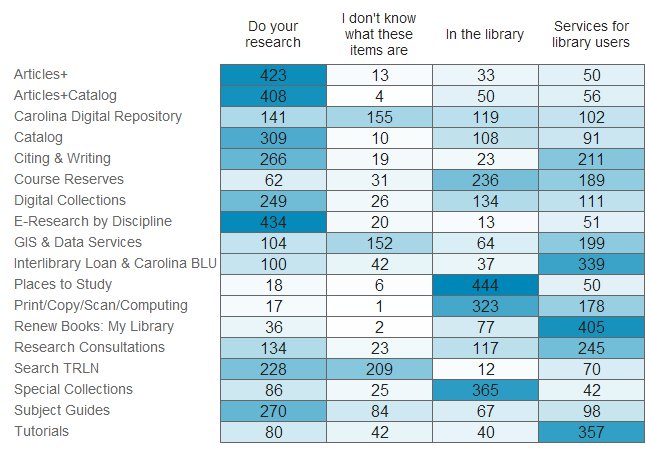
Analogous to an in-person card sorting exercise, in an Optimal Sort test users are shown a list of text items and asked to sort them into categories. We used it to get at how our menu navigation could or should be organized. Results are shown in a matrix of where each item got sorted:

Click for larger view

Click for larger view

Our results mostly validated our existing menu organization choices, but along the way we accidentally discovered something interesting!

We provided users with the option to sort items into a category called “I don’t know what these items are”. The original idea was to avoid users sorting an item randomly if they didn’t truly have an idea of where it should go. But a couple of items proved unexpectedly popular in this category, so now we know that some of our naming conventions need to be addressed.

Optimal Workshop’s third tool is Treejack, which is designed to test a site structure. We haven’t used it yet, but I’m looking forward to putting it through it’s paces.

Summing Up

Our website is an iterative project, one that is never truly finished. Optimal Workshop lets us run frequent tests without significant staff time involved in the execution, and to reach more users than we ever could in person. Even the free plan, with it’s 10 response limit, is still useful enough to get actionable data in the right context.

Are any other libraries using it? I’d love to hear what you’re testing.

ALA 2014: My two WordPress presentations

After a couple years off, I’m returning to ALA’s annual conference this year. I’m obviously excited to see colleagues and the Vegas sights, but I’m also looking forward to my two presentations there. If you’d like to come hear about how we redesigned the UNC Libraries website and moved it into WordPress, you’ve got two options:

I’m running through a short lightning talk style overview of our process at the Tech Speed Dating session organized by LITA’s Code Year Interest Group. That’s Saturday, 6/28 from 1:00-2:30 in Convention Center room N119. There’s a bunch of other great talks in that session on the list too, including a demo from SparkFun.

Think of that as the preview for the full session on Sunday. Emily King and I have a whole session to ourselves where we’ll walk through our redesign and content strategy development process from start to finish. This one’s Sunday, 6/29 from 4:30-5:30 in Convention Center room N243. Late in the day, I know, but come rest and learn before hitting the strip.

Both sessions will cover how we made WordPress work for us, how our migration worked, and what our ongoing content & site maintenance has been like since launch. I hope to see you there!

My presentations from Computers in Libraries 2014

I was fortunate enough to have two presentations accepted at Computers in Libraries this year in DC. As always I’m not sure if my slides make much sense without my accompanying narration, but I’m happy to answer questions about them.

Both sessions were collaborations. I presented “Moving Forward: Redesigning UNC’s Library Website” with Kim Vassiliadis, and “Rock your library’s content with WordPress” with Chad Boeninger. Thanks to all who came out! We had some great discussions during and after.


Semi-Automatic Chat: Speeding up reference questions in Pidgin

This is an expanded write-up of a lightning talk I presented at the 2014 LAUNC-CH conference:

Some background: We answer reference questions via chat at the reference desk using the amazing Libraryh3lp service. We log in and conduct chats with Pidgin. Libraryh3lp isn’t required for this to work, but Pidgin is.

A few months ago, a colleague asked me if there was a way to quickly cut and paste frequent responses into a chat. We end up repeating ourselves quite a bit when a common question comes up, and it seems rather inefficient.

Thankfully, Pidgin has a built-in plugin called (aptly enough) Text Replacement.

To get it up and running:

  • In Pidgin, go to the Tools menu.
  • Click Plugins.
  • Check the box next to Text Replacement.
  • While Text Replacement is highlighted, click Configure Plugin.

This is the screen where you configure your text replacement. The basic idea is that you set a keyword. Whenever a user types that keyword, Pidgin automatically replaces it with a pre-set block of text. So for example, in our case typing “$hi” will produce: “Hi, how can I help you today?”

To add a new replacement at the Configure screen:

  • Fill out the ‘you type’ and ‘you send’ boxes appropriately. I recommend starting each ‘you type’ trigger with a $, which should help avoid accidental replacements.
  • Uncheck the ‘only replace whole words’ box.
  • Click Add.
  • click Close.

Now your text replacement is active! Repeat as necessary to create others.

We use Pidgin at multiple computers simultaneously, so I wanted to be able to duplicate these replacements at each station without having to do it manually.

Pidgin stores the plugin’s text replacement library here:
C:\Users\USERNAME\AppData\Roaming\.purple\dict

To move this file to another computer:

  • On the destination PC, repeat the first chunk of steps above to enable the Text Replacement plugin.
  • Copy the dict file from the source PC to the same location on the destination PC.
  • Restart pidgin on the destination PC.

Now we’re in business! The next step was to figure out exactly what we wanted to replace. Read more if you’re interested.

Exporting page details from WordPress for a content review

Now that we’ve got a large chunk of the UNC Library site‘s content in WordPress, we’re working on setting up a system to do semi-annual content reviews. Before we can plan the review itself, we needed to be able to pull details about our pages from the CMS. WordPress doesn’t have a simple way to export page metadata that would be useful for this task, like the last modified date and the name of who last modified it. As with anything in WordPress, there are of course plugins that would do this for us. But I’m trying to keep our plugin count as low as possible. And a plugin seems like overkill for this kind of thing anyway.

I used the opportunity to expand my WordPress coding chops a tiny bit, and dug into their codebase. A very helpful StackOverflow thread set me on the right path, and wpquerygenerator.com made writing the actual query dead simple.

Here’s my code, also embedded below. Put it in a .php file in your root WordPress directory, then open it in your browser. You’ll get a tab-delimited file suitable for importing into Excel. It includes the title, url, last modified date, and last modified author for your site’s last 50 edited pages. If you want other fields, the code is pretty easy to play with.

From there we’ve got a nice list to start reviewing!

Redesign of the UNC Libraries’ website

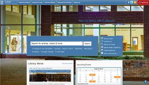
Desktop homepageLast month we debuted the completely overhauled UNC Libraries website at library.unc.edu. Roughly a year in the making, this is a huge step forward for the Library.

Our old site was entirely hand-maintained pages, and included over 60,000 files (HTML, CSS, images, php, etc). My jaw dropped when we uncovered that number during our initial site inventory! We slashed most of that away, and moved what was left into WordPress. Even if that was all we did, being in a content management system would help immensely whenever the next redesign comes around. But our new design is also more flexible, modern, and usable.

I’m not going to quote an exact number of how many files we have left, since it’s a falling number as we move more and more of the remnants into WordPress, but it’s in the neighborhood of 10% of what we had at the start.

This was my department’s major project for quite some time, but User Experience is far from the only unit deserving credit. Our developers and countless stakeholders who advised us made it all possible.

Some of my favorite things about the new site:

  • It’s responsive! We’re still tweaking the exact trigger points, but the site reorganizes itself to work well on a desktop, tablet, or mobile browser. Here’s a screenshot of the mobile view. I’m so excited that we won’t have to maintain a whole separate mobile site anymore!
  • The new Places to Study page (inspired by Stanford’s wonderful feature) lets students filter our physical locations and find what they’re looking for in a study space.
  • Thanks to the Formidable plugin we have easy and powerful centralized form management. We even use it as a simple ticketing system for managing user feedback about the site.
  • Our staff directory is so much more usable and detailed than the old version. Something like this doesn’t have a huge impact on our site’s overall usability, but will make a big difference for internal use.
  • The big background images really show off our spaces.
  • Our new hours page, while not actually part of WordPress, does a great job of displaying our many branches’ status at a given moment.

We don’t consider this a completed project by any means. We’re well into Phase II now, wrangling the pieces of content into place which proved a bit too unwieldy to be ready by launch.

I’ll admit I was skeptical about WordPress’ ability to serve as a full-fledged website CMS. While I’ve used it as a blogging platform for almost 9 years, I’d never gotten deeply into all it can offer. I was happy to be proven wrong! WordPress has proven to be a flexible and powerful platform, and I’m quite excited to keep working with it. When I think about how much more maintainable the new site is, I practically get giddy.

Our early feedback is largely positive, and we plan on doing some serious user feedback campaigns to guide our future work. Thank you to all who have worked with us on this project!

I’m sure I’ll be writing (and hopefully presenting) more about this in the near future.

Defining what I do: What makes a technology emerging or disruptive?

Up the Hatch!

“I’m the Emerging Technologies Librarian at UNC.”

“So what does that mean?”

Every time I meet someone new at work, that’s how the conversation goes.

My response usually consists of arm flailing and a disjointed summary of my duties. I’m working on that. But I think people mostly don’t know what my job defines as an “emerging technology”.

To be honest, as the years go by I’m less a fan of that term. “Emerging” is too broad. Any new technology emerges, just by virtue of being new. Solar power is an emerging technology, and even something as simple as seatbelts once was too. I can’t keep an eye on everything. Instead, I find myself looking at a new technology and asking: Is it disruptive to libraries? “Disruptive” does a better job of defining what I deal with on a day to day basis. The technologies I look at tend to be new and emerging, but as they emerge they also disrupt that context and the way we do things.

I tend to define things by removing what they’re aren’t, plus there’s a lot more tech that doesn’t disrupt libraries than that which does. Xbox Kinect is interesting and definitely emerging, but I don’t see a lot of immediate disruption coming from it in my academic library corner of the world. I also don’t see a lot of relevance for 3D printers in the core parts of my particular work environment, but they’re definitely emerging as technology. As sci-fi author Neal Stephenson recently noted in Arc 1.3, “…[3D printing] isn’t a disruptive idea on its own. It becomes disruptive when people find their own uses for it.”  It’s when an actual or likely use impacts libraries that I pay more attention.

So now I have to define what makes a technology disruptive for my purposes. My definition is a bit hard to nail down, but I think I’ve settled on something close to “a technology that could change the way academic libraries deliver services and information.”

Based on that, eBooks are an obvious disruptive technology in libraries. And in a general sense the web continues to disrupt everything in our core mission.

Now I’ve established criteria for which disruptive technologies I deal with in my job. But how do I spot disruptive technologies for evaluation in the first place? Disruptive technology arrives in two different flavors. The first kind does something new and interesting well, but misses a basic feature of an existing technology. The second kind creates an entirely new niche for itself, carving out existence without an obvious analogue anywhere else.

TYPE ONE

Google Voice is a prime example of the first kind of disruptive tech. It adds a number of very useful features to our venerable old phone numbers, but also doesn’t support MMS messaging or certain types of SMS shortcodes at all. I don’t use either of those features on my phone often, but it’s enough that I’d miss them if I moved over to Google Voice.

Later, the disruptive tech might fill in those gaps and be more fully emerged as a replacement. But I have real trouble coming up with examples of tech that successfully made this transition. Google Voice is still plugging right along, but shows no signs of fixing my dealbreakers. Other examples have been less fortunate; their feature gaps were important enough that they eventually faded away. Netbooks took off on their amazing portability and battery life, but their tiny keyboards and often limited processing power meant they peaked early and are now fading. Google Wave tried to reinvent email with a treasure trove of added features, but had an impenetrable UI and lacked a clear use case. It lasted 15 months. Uber’s car service is heavily disrupting the taxi industry, but is so far outside the box that it’s meeting significant legal pushback and sabotage there. Look at 3D printers again: they provide all kinds of disruptive challenges to traditional manufacturing. But the technology is also extremely fiddly and requires a lot of customization, expertise and constant adjustment to use. It’s future will depend on whether the printers can overcome those gaps and more fully emerge into everyday use.

In the academic library world, this first type of disruptive technology describes ebooks perfectly. They add new functionality to the traditional task of consuming text, but thanks to DRM and licensing we can’t share them as easily and have questions about long-term viability of the titles in our collection. Ebook readers fit too, for similar reasons. I’m obviously keeping a close eye on them and am involved with a number of ebook-related projects and programs on campus. The recent trend of massively online courses like Udacity and Coursera qualifies as this type of disruption as well, though for higher ed in general. Instant messaging continues to disrupt the way we provide service at the reference desk.  So those are three areas I’m focusing on lately.

TYPE TWO

Not all emerging technologies fit that first model. Instead of changing something we already have, the disruption a technology creates may carve out a whole new space for itself. The iPad is the obvious example here; Apple pretty much created the modern tablet market. But despite being a new market, tablets still disrupt laptops, ebook readers and smartphones. Cell phones in a general sense fit this second model of disruption too, incidentally. I have a harder time coming up with more examples here, especially ones relevant to academic libraries. Most of our disruptions come from modifications to existing technologies or systems, and very few spring forth into an entirely new niche. Still, iPads and other tablets have huge implications for desktop computing facilities in my library and on my campus. Even if the disruption isn’t obvious, it’s still important to recognize the difference in how it comes about. Libraries need to keep an eye on changes to both current niches and the emergence of entirely new ones.

PHASES OF DISRUPTION

No matter which type of disruption a technology fits, all of them go through early, middle and late phases of disruption. Early on, they’re pretty experimental with notable feature gaps. Google Wallet and their system of NFC payments fits the early bill right now. I think Google Voice seems to be stuck in this early phase too, and shows no indication of advancing beyond it. Before the release of the Kindle I’d also have put ebooks at this point. They were a niche interest at best.

By the middle phase, a technology has a foothold in the general public – not just among early adopters. In April we learned that 21% of American adults read an ebook last year, and 45% now own a smartphone. They’re not anywhere near universal adoption yet, but it’s significant and trending upward.

Eventually some of these technologies close in on finishing their disruption. By that point they’re into the late phase. I classify MP3s as a late phase disruption, for example. In many demographics they’ve completely replaced CDs, the technology they disrupted. Of course CDs, vinyl, and other music distribution methods do still exist. Not everyone has the technical literacy to make the change in their personal music collection, though an increasing majority do.

After the final stage of disruption, that ’emerged’ term pops up again. Emerging technologies go through phases of disruption, but ultimately must become fully emerged or at some point fade away. Blogs disrupted traditional web publishing (if there can be said to be such a thing), but are now a fact of online life. They’re emerged. Digital cameras and (non-smartphone) cell phones are emerged too.

FULL CIRCLE

We’ve come back around to dealing with emerging technologies. But on a day to day basis, I’m more concerned with following their progress through phases of disruption. If we can figure out which technologies with potential implications for libraries will make it through the phases, we can get ahead of the game. Or at least keep pace and stop anything from blowing up in our faces.

And that’s why I flail my arms when someone asks me what my job title means: I haven’t found a way to distill all this into a soundbyte yet. But as a collective institution, libraries are ripe for disruption. In my job I try to keep a practical focus on the horizon and do my part to keep us a bit ahead of the curve.

Android’s App Inventor: Drag and Drop Programming

It took a while, but Friday afternoon I finally got an invite to use Google’s App Inventor program. What is App Inventor? It’s Google’s attempt to simplify building apps for Android devices. Apps are built using a drag and drop interface, and reflected instantly on a connected Android device.
App Inventor UI screenshot

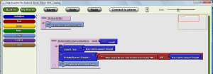
I was skeptical about the system’s ability to produce apps of any real functionality, but I was happy to be proven mostly wrong. Building a well-structured UI is admittedly almost impossible, with only basic layout and design tools available. But the app inventor does provide easy access to surprisingly complex elements of the Android functionality. The GPS, barcode scanner, camera, speech recognition, and accelerometer are among the tools easily usable via drag and drop. After placing buttons and labels to design the UI, a separate drag and drop interface is used to establish how those elements interact with each other. A series of blocks click into each other, with a bit of typing to provide some details.

Blocks Editor

It’s a nice system, and my skepticism about App Inventor’s potential beyond the toy level was quickly overcome. I ran through the first tutorial app (touch the picture of a cat and it meows! This didn’t help my skepticism…) in a few minutes. Less than an hour later I’d built an app to search the UNC catalog via an ISBN barcode scan. It relies heavily on our existing catalog webapp to do the actual search, but still! I mastered using the barcode scanner for apps in less than an hour. My previous attempt at Android programming (in Java, before App Inventor existed) took me four hours to build an app that simply displays an image. And that simple task drew on every single bit of programming know-how I could dredge up from my undergrad days.

The barrier to entry for using App Inventor is almost absurdly low. My slight background in programming did help, and I would have taken a bit longer if I wasn’t familiar with things like variables and function returns. But the point of App Inventor is that I wasn’t required to know those things in advance. I could have picked it up in a little extra time. This kind of setup seems perfect for intro-level computer science courses, teaching basic programming concepts while retaining the satisfaction of seeing a fully functional app at the end. Google definitely realizes this and is targeting educators as potential users.

App Inventor is clearly still a beta product, with some notable limitations. Apps built in App Inventor can’t be distributed in the Android Market. The install files need to be manually distributed to phones. There’s also no resulting Java source code to tweak for more advanced purposes. And disappointingly, using APIs beyond a prescribed few (Twitter, Amazon, etc) involves more complicated Python coding. There’s also some strange odds and ends, like not being able to change the app’s icon.

I’m not under any illusions that App Inventor apps will someday replace Java-coded apps. But it got me excited about programming in a way I haven’t been in years. That’s gotta count for something.

If you’d like to try the barcode scanner app I built and see what App Inventor is capable of, here’s the installable apk file: http://dl.dropbox.com/u/905114/UNC_Catalog.apk