Usability and Amazon Premium Headphones

51IubYYzI-L._AA1500_[1]I’ve finally found a pair of headphones that I actually enjoy using: Amazon’s Premium Headphones.

As a product category, headphones continually frustrate me. I use them all the time while commuting. I shove them in my messenger bag, fish them out at odd times, and usually end up losing them within a year. I also have relatively small ear canals (according to my doctor), so in-ear types often don’t fit me well or end up hurting after far too little time.

My ideal pair of headphones would, in no particular order:

  • Be tangle-free or wireless
  • Include some kind of controls (volume, play/pause, etc)
  • Fold or coil up into a compact size
  • Fit in or on my ears
  • Produce at least average sound (I’m not an audiophile)
  • Be cheap (< $20) for replacement purposes

I’ve lived with cheap skullcandy in-ear headphones for years, which met some of these qualifications: They’re cheap, have a volume control, sound decent, coil up well, and mostly fit in my ears thanks to coming with different sizes of rubber earbuds. But that fit isn’t ideal, and I’m constantly untangling them.

I also own a pair of Motorola S305 bluetooth headphones, for situations where wireless is important. They don’t fold up and are too expensive to replace regularly, but are otherwise a good choice and meet all my criteria.

Now I think I’ve found a new favorite pair, from an unlikely source: The headphones that come with Amazon’s Fire phone are nearly perfect!

Say what you will about the Fire phone itself, but the accessory headphones (available separately as the awkwardly named “Amazon Premium Headphones”) tackle headphone usability in some interesting ways:

  • Most of the cable is flat, not round, and relatively stiff. This part of the cable never gets tangled at all.
  • The earbuds themselves are magnetic, and stick together when not in use. This reduces tangles even more.
  • The built-in controls are simple and useful. Tap the button once to pause/resume, or twice to go to the next track. And the volume controls are the first I’ve seen on a wired pair that directly control my phone’s volume, instead of just modulating what’s going through the headphone cable.
  • The earbuds don’t go deeply into the ear canal, meaning they actually fit me. They’re shaped similarly to Apple’s current earbuds, but those always fell right out of my ears. Amazon has slightly tweaked the shape for a more secure fit.

So they’re tangle-free, have excellent controls, coil up well, fit in my ears, sound decent enough, and cost $10-$15. I love these things, even if I’m still a bit confused that something decent came out of the Fire phone’s release. I’d better go stock up on some extras while they’re still available.

Usability testing with Optimal Workshop

ow_logoUsability testing is one of the best parts of my job. I love hearing from users about how they interact with the library’s website and then figuring out what we can change to better meet their needs.
The dark side of this testing is the sheer time involved. Recruiting, scheduling, and sitting down with each individual user can be a daunting commitment of staff hours. I’ll say upfront: that type of testing is still great! It definitely has a place. But we’ve started using a tool that lets us run more tests, more often: Optimal Workshop.

One important bit: While Optimal Workshop has a free plan, you’ll get the most out of it if you spring for the paid level. It’s on the pricey side, but keep in mind that they offer a 50% discount to educational customers.

What we did

We used two of the suite’s three tools in a study earlier this year: Chalkmark and Optimal Sort. We advertised the tests with a pop-up on our homepage that was displayed to half our visitors. All respondents were able to enter a drawing for a $50 Amazon gift card at the end. We expected to run the tests for at least two weeks to get enough responses. But after just a week we had more than 500 and were able to conclude it early. That number exceeded my wildest expectations! Here’s how we used each tool:

Chalkmark

Think of Chalkmark as a first-click test. You display a screenshot or design draft to your users, and ask them where they’d click first to accomplish a given task. Results are displayed in a heatmap that’s easy to parse at a glance. For example, we asked users where they’d click first to search for a book on our homepage:

Click for larger view

Click for larger view

82% of clicks were either in our main search box or on the link to our catalog. That’s great! They were able to find their way to a book search easily. Another 7% clicked on our Research Tools menu. While that’s not ideal, it’s also not a bad option; they’ll see a page with a link to the catalog next. That leaves about 11% of our users who went astray. Thanks to some demographic questions we asked, we know a little about them and can try to figure out what was confusing or unintuitive to them in future tests. We can also view other heatmaps based on those demographic questions, which is proving useful.

(Side note: We asked library staff to take the same test, and got very different results! Fascinating, but the implications are still unclear and a topic for another time)

Optimal Sort

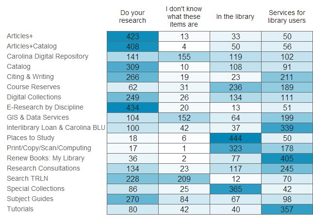
Analogous to an in-person card sorting exercise, in an Optimal Sort test users are shown a list of text items and asked to sort them into categories. We used it to get at how our menu navigation could or should be organized. Results are shown in a matrix of where each item got sorted:

Click for larger view

Click for larger view

Our results mostly validated our existing menu organization choices, but along the way we accidentally discovered something interesting!

We provided users with the option to sort items into a category called “I don’t know what these items are”. The original idea was to avoid users sorting an item randomly if they didn’t truly have an idea of where it should go. But a couple of items proved unexpectedly popular in this category, so now we know that some of our naming conventions need to be addressed.

Optimal Workshop’s third tool is Treejack, which is designed to test a site structure. We haven’t used it yet, but I’m looking forward to putting it through it’s paces.

Summing Up

Our website is an iterative project, one that is never truly finished. Optimal Workshop lets us run frequent tests without significant staff time involved in the execution, and to reach more users than we ever could in person. Even the free plan, with it’s 10 response limit, is still useful enough to get actionable data in the right context.

Are any other libraries using it? I’d love to hear what you’re testing.

My presentations from Computers in Libraries 2014

I was fortunate enough to have two presentations accepted at Computers in Libraries this year in DC. As always I’m not sure if my slides make much sense without my accompanying narration, but I’m happy to answer questions about them.

Both sessions were collaborations. I presented “Moving Forward: Redesigning UNC’s Library Website” with Kim Vassiliadis, and “Rock your library’s content with WordPress” with Chad Boeninger. Thanks to all who came out! We had some great discussions during and after.


Semi-Automatic Chat: Speeding up reference questions in Pidgin

This is an expanded write-up of a lightning talk I presented at the 2014 LAUNC-CH conference:

Some background: We answer reference questions via chat at the reference desk using the amazing Libraryh3lp service. We log in and conduct chats with Pidgin. Libraryh3lp isn’t required for this to work, but Pidgin is.

A few months ago, a colleague asked me if there was a way to quickly cut and paste frequent responses into a chat. We end up repeating ourselves quite a bit when a common question comes up, and it seems rather inefficient.

Thankfully, Pidgin has a built-in plugin called (aptly enough) Text Replacement.

To get it up and running:

  • In Pidgin, go to the Tools menu.
  • Click Plugins.
  • Check the box next to Text Replacement.
  • While Text Replacement is highlighted, click Configure Plugin.

This is the screen where you configure your text replacement. The basic idea is that you set a keyword. Whenever a user types that keyword, Pidgin automatically replaces it with a pre-set block of text. So for example, in our case typing “$hi” will produce: “Hi, how can I help you today?”

To add a new replacement at the Configure screen:

  • Fill out the ‘you type’ and ‘you send’ boxes appropriately. I recommend starting each ‘you type’ trigger with a $, which should help avoid accidental replacements.
  • Uncheck the ‘only replace whole words’ box.
  • Click Add.
  • click Close.

Now your text replacement is active! Repeat as necessary to create others.

We use Pidgin at multiple computers simultaneously, so I wanted to be able to duplicate these replacements at each station without having to do it manually.

Pidgin stores the plugin’s text replacement library here:
C:\Users\USERNAME\AppData\Roaming\.purple\dict

To move this file to another computer:

  • On the destination PC, repeat the first chunk of steps above to enable the Text Replacement plugin.
  • Copy the dict file from the source PC to the same location on the destination PC.
  • Restart pidgin on the destination PC.

Now we’re in business! The next step was to figure out exactly what we wanted to replace. Read more if you’re interested.

My week with Google Glass: Personal life thoughts

I was lucky enough to spend last week with a loaner pair of Google Glass. Purchased by my place of work, I was asked to try them out and evaluate them for possible library use or development of apps by the library. I’m far from the first person to write about their experience with Glass, but I wanted to write up my experience and reactions as an exercise in forcing myself to think critically about the technology. I’m splitting it into two posts: One about the impact and uses of Glass in libraries was posted yesterday, and this is the second: my more general impressions as a Glass user and how it might fit into my daily life.

To cut to the chase: Google Glass is an extremely impressive piece of technology squeezed into a remarkably small package. But it does have issues, and Google is right to declare that it isn’t ready for mass market adoption yet.

What I didn’t like about Glass:

  • Battery life is anemic at best, especially when using active apps like Word Lens. I rarely got more than 4-5 hours of use out of Glass, and sometimes as little as 30 minutes.
  • I’m blind without my (regular) glasses. I know that prescription lenses are now available for Glass, but the $250 price tag means there’s no way I could justify getting them for a one week trial. And because Glass’ frame doesn’t fold up in the way that regular glasses do, there’s no easy way to carry them around to swap out with regular glasses for occasional use. Despite being impressively small for what they do, they’re still too bulky.
  • Many apps on Glass are launched with a spoken trigger phrase. Remembering them all is awkward at best, and I sometimes flashed back to MS-DOS days and searching for the right .exe file to run.
  • Confusingly, Glass does not auto-backup photos and videos taken with it. My Android phone dumps all media to my Google account, but Glass won’t do that unless it’s plugged in and on wifi.
  • Style and social cues, the two elephants in the room, has to be addressed. Right now I don’t think I could ever get up the courage to wear Glass in public on a regular basis. But when the tech shrinks even more and can be embedded in my regular glasses, then things will get interesting. The social mores around wearable tech still need to be worked out. I did not feel comfortable pushing those bounds except in very limited circumstances (like walking around on a rainy cold day with my bulky hood pulled up around Glass), and rarely wore Glass in public as a result.
  • Taking a picture by winking alternately delighted and horrified me. I’d love to see more refined eye movement gesture controls, instead of just the one that’s associated with so much unfortunate subtext.

What I loved about Glass:

Nora through GlassBut as a camera, Glass excels. My daughter is 13 months old, and invariably stops doing whatever ridiculously cute thing she’s doing the moment I get out a camera to capture it. The camera becomes the complete focus of her attention. But if I’m wearing Glass, I can take a picture at a moment’s notice without stopping what I was doing. A wink or simple voice command, and I have a snapshot or short video saved for perpetuity. In my week I got some amazing Glass pictures of my daughter that I never would have otherwise. For a brief moment this alone made the $1500 price tag seems oddly reasonable.

Side note: This easy hands-free capture of photos and video has fascinating implications for personal data and photo management. With such a giant pile of media produced, managing it and sorting through the bad shots becomes a herculean task. I don’t know that there’s a solution for this yet, though admittedly I think Google Plus’ automatic enhancement and filtering of photos is a great first step.

Back to what I like about Glass:

Other than taking photos of kids, I ran into three other use cases that genuinely excited me about using Glass in everyday life:

Biking with GlassThanks to Strava’s integration with Google Glass, I was able to try Glass on a short cycling excursion. With live ambient access to my speed, direction, distance, and maps, I was in biking heaven. And I still had access to a camera at a moment’s notice too! Admittedly, all of this is stuff that my smartphone can do too. But using a smartphone while on a bike is a dicey proposition at best, and something I really don’t want to do. Glass’ ambient presentation of information and reliance on voice controls make the idea viable. I’m not sure I’d use it on a busy road, but on paths or dedicated bicycle lanes I’m sold.

I also happened to have Glass on while cooking dinner, and while I couldn’t figure out how to easily load a recipe other than searching the web for it, I have to assume an Epicurious or other recipe-centric app isn’t far off. Voice-controled access to recipes and cooking tips, without having to touch buttons with my messy or salmonella-laden hands, is something I want.

My third compelling use case is the Word Lens app I mentioned previously. Real-time, ambient translation! Not that I need another reason to want to visit Paris, but I really want to try this in action in a foreign country.

Analysis:

All three of these cases have one simple thing in common: They involve a task that is greatly improved by becoming hands-free. Taking pictures of my daughter at play, assistance while cooking a meal, and ambient translation of text are all much better (or only possible at all) by removing the hands-on requirement of an interface. I believe this hands-free factor will be key in which apps are successful on Glass (and other future wearable tech) and which fall by the wayside.

Other functions, like saving voice notes to Evernote or doing live video chat, were kind of neat but didn’t strike me as particularly revolutionary. My phone does all of that well enough for me already, and the tasks aren’t significantly enhanced by becoming hands free. Navigation while driving is something I never felt comfortable doing with Glass, as I found it somehow more distracting than doing the same on my phone.

But much of what I tried on Glass doesn’t really fall into a category of something I liked or disliked. Instead, many of the apps just seem silly to me. While I might want to post to Facebook or Twitter from Glass, do I really need pop-up notifications of new posts in the corner of my eye? The prototype Mini Games app from Google features a version of tennis where you have to crane your neck awkwardly around to move around, or pretend to balance blocks on your head. I tried things like this once, and then moved on. And while it’s nice in theory to be able to play music on Glass, the low quality speakers and ease of annoying your neighbors with this feature means I’d never want to actually use it.

Some of my confusion or frustration with these functions will no doubt be addressed in future generations of the hardware. But if I can give some amateur advice to Glass developers: Focus on making everyday tasks hands free, and you’ll win me over.

When Glass inevitably hits a more consumer-friendly price point, I’ll probably pick one up. Right now I have a hard time recommending it at $1500, but of course even Google themselves consider this a sort of beta product. This a test-bed for wearable technology, and I’m grateful to have had a glimpse of the future.

My week with Google Glass: Library-centric thoughts

I was lucky enough to spend last week with a loaner pair of Google Glass. Purchased by my place of work, I was asked to try them out and evaluate them for possible library use or development of apps by the library. I’m far from the first person to write about their experience ewith Glass, but I wanted to write up my experience and reactions as an exercise in forcing myself to think critically about the technology. I’m splitting it into two posts: One about the impact and uses of Glass in libraries, and a second about my more general impressions as a Glass user and my overall daily life.

Without further ado, lets look at the library perspective: I came away with one major area for library Glass development in mind, plus a couple of minor (but still important) ones.

One big area for library development on Google Glass: Textual capture and analysis

Image from AllThingsD

Image from AllThingsD

One of the most impressive apps I tried with Glass, and one of only a handful of times I was truly amazed by it’s capabilities, was a translation app called Word Lens. Word Lens gives you a realtime view of any printed text in front of you, translated into a language of your choice. In practice I found the translation’s accuracy to be lacking, but the fact that this works at all is amazing. It even attempts to replicate the font and placement of the text, giving you a true augmented view and not just raw text. Word Lens admittedly burned through Glass’ battery in less than half an hour and made the hardware almost too hot to touch, but imagine this technology rolled forward into a second or third generation product! While similar functionality is available in smartphone apps today (this is a repeating refrain about using Glass that I’ll come back to in my next post), translation, archiving, and other manipulation of text in this kind of ambient manner via Glass makes it many times more useful than a smartphone counterpart. Instead of having to choose to point a phone at one sign, street signs and maps could be automatically translated as you wander a foreign city or sit with research material in another language.

I want to see this taken further. Auto-save the captured text into my Evernote account and while you’re at it, save a copy of every word I look at all day. Or all the way through my research process. Make that searchable, even the pages I just flipped past because I thought they didn’t look valuable at the time. Dump all that into a text-mining program and save every image I’ve looked at for future use in an art project. I admit I drool a little bit over the prospect of such a tool existing. Again, a smartphone could do all of this too. But using Glass instead frees up both of my hands and lets the capture happen in a way that doesn’t interfere with the research itself. The possibilities here for digital humanities work seem endless, and I hope explorations of the space include library-sponsored efforts.

Other areas for library development on Google Glass:

Tours and special collections highlights

The University of Virginia has already done some work in this area. While wandering campus with their app installed, Glass alerts you when you’re close to a location referenced in their archival photo collections and shows you the old image of your current location. This is neat, and especially while Glass is on the new side will likely get your library some press. NC State’s libraries have done great work with their Wolfwalk mobile device tour, for example, which seems like a natural product to port over to Glass. This is probably also the most straightforward kind of Glass app for a library or campus to implement. Google’s own Field Trip Glass and smartphone app already points out locations of historical or other interest to you as you walk around town. The concept is proven, works, and is set for exploitation.

Wayfinding within the library

While it would likely require some significant infrastructure and data cleanup, I would love to see a Glass app that directs a library user to a book on the shelf or the location of their reserved study room or consultation appointment. I imagine arrows appearing to direct someone left, right, straight, or even to crouch down to the lower shelf. While the tour idea is in some ways a passive app, wayfinding would be more active and possibly more engaging.

Wrap-up

The secondary use cases above are low-hanging fruit, and I expect libraries to jump onboard with them quickly. Again, UVA has already forged a path for at least one of them. And I fully expect generic commercial solutions to emerge to handle these kinds of functions in a plug and play style.

Textual capture and analysis is a tougher nut to crack. I know I don’t have the coding chops to make it happen, and even if I started to learn today I wouldn’t pick it up in time before someone else gets there. Because someone will do this. Evernote, maybe, or some other company ready to burst onto the scene. But what if a library struck first? Or even someone like JSTOR or Hathi Trust? I’m not skilled enough to do it, but I know there’s people out there in libraryland (and related circles) who are. I want to help our users better manage their research, to take it further than something like Zotero or the current complicated state of running a sophisticated text mining operation. The barriers to entry on this kind of thing is still high, even as we struggle to lower it. Ambient information gathering as enabled by wearable technology like Glass has the potential to help researchers over the wall.

Tomorrow I’ll write up my more general, less library oriented impressions of using Glass.

10 terrible things about using WordPress as a large scale content management system

(This is a companion piece to yesterday’s post, 10 great things about using WordPress as a large scale content management system)

After spending a few months administering a large WordPress site at work, a handful of things have grown to drive me crazy. I still like the system more than I dislike it, but here’s ten things in need of improving:

1. Plugins

Yes, this one is on both the positive and negative lists. Plugins add virtually any feature you want to your site, but not all of them are actively maintained. They can also conflict with each other, leading to the unenviable situation where you have to pick one very useful plugin over another. Every time a plugin gets updated, I hold my breath and franticly check the site to see if anything broke.

2. You will need a programmer

Working with custom themes and types is amazingly useful, but you will need a developer to do it (or someone willing to quickly learn). Staff time for this kind of customization is significant.

3. Media management

For a content management system, WordPress does an awful job at managing multimedia content. It began life as a blogging platform, not a full website CMS, and in media management those roots show. WordPress lacks anything beyond the most basic ability to organize media, and we haven’t found a plugin to fill in the gaps yet either. For example: There’s no way to see a list of which pages an image is used on. This would be extremely useful to know when cleaning out old image content.

4. Updates

Expanding on the plugin problem above, WordPress itself also has updates. Like the plugins, it’s difficult to know if any update will break something important on your site. And even if it does, you need to update anyway. WordPress updates often address security issues, and lagging behind leaves your site vulnerable.

5. Moving From Test to Live

We have struggled to set up a workflow to test a new plugin or update before rolling it out to our live site. We maintain a separate development WordPress server, but it is rarely 100% in sync with our live server. And even if it is, we might spend hours configuring and tweaking a new plugin on the development server. Unless that plugin has an export/import feature (and many don’t), we have to do all that configuring all over again on the live version.

6. Content Editor Inconsistencies

This might be my pet peeve about WordPress. When editing a page, users have the option to write raw HTML or work with a more WYSIWIG-style editor. Going back and forth between the two sometimes causes odd display issues, especially when line breaks are involved.

7. Differentiating Pages and Posts is Confusing

Owing again to its roots as a blogging platform, WordPress has two main types of content: Posts and Pages. We work almost exclusively with Pages on our site, but it’s very easy to accidentally get lost in the Posts options instead. This is especially true for users who might have used WordPress as a simple blog before, avoiding Pages entirely. The difference is subtle, but important.

8. Spam

While not specifically a fault of WordPress, you will get spam. We’ve disabled comments on our pages, which eliminates a large chunk off the bat, but we still get a ton through our various request forms. If you want to buy an NFL jersey from China, boy do I have the website for you! I dislike captchas from a usability standpoint, but I think we may be forced to add them to our forms.

9. There’s a Whole Lotta CSS Involved

WordPress can get very complicated, very fast, and that includes the CSS it generates. We spent countless hours debugging our menu’s CSS, trying to get it to look and work correctly across browsers. It looks nice, but if you want to change the design I hope you can parse through a bunch of spaghetti code.

10. It Can’t Be Everything to Everyone

As much as we love the idea, we weren’t able to put 100% of our content into WordPress. We’re significantly invested in Libguides as our course page and subject guide platform, for example. While we were able to get our WordPress menu to appear at the top of our Libguides pages, the two content management systems are very much running side by side. That’s just one example of the ways we have content living outside of WordPress. I’m thrilled to have the bulk of our content in WordPress, but it didn’t work out as a complete one-stop solution.

We have workarounds for most of this, and the rest is largely bearable. But media management and editor inconsistencies stick out to me like sore thumbs, and I hope they’re improved soon.

(This is a companion piece to yesterday’s post, 10 great things about using WordPress as a large scale content management system)

10 great things about using WordPress as a large scale content management system

(This is a companion piece to another post, 10 terrible things about using WordPress as a large scale content management system)

Now that I’ve spent some time on a team administering WordPress on a large scale, I can point to ten things I really like about using this CMS in our environment:

1. Plugins

WordPress has a mind-bogglingly large repository of plugins available. If there’s a feature you wish WordPress had, 99.99% of the time you can find a plugin to do it.

2. Responsive Themes

Do yourself a favor and pick a responsive theme. It’ll reorganize your pages to display in a much more usable fashion on mobile devices and other unforeseen oddball screen sizes.

3. Granular User Permissions

WordPress’ built-in user role management functions leave a little bit to be desired, but (see above) there’s a plugin for that! Press Permit took a bit of time to figure out, but now lets us make sure users only have access to the pages they need to maintain. This cuts down on accidental edits or deletions, and provides a less cluttered interface to our staff.

4. Formidable Plugin to Manage Forms

Formidable is an amazingly flexible plugin for adding forms to your site. It’s got power on the back end too: We use hidden fields to turn it into a rudimentary ticketing system for website support requests.

5. Extensibility

WordPress’ custom types make it possible to add your own arbitrary data types to the system. Through types we were able to add our study spaces as items in WordPress.

6. Shortcodes

Shortcodes should be the #1 feature marketed by WordPress! They’re simply reusable blocks of text. For example, we have building policies that are consistent across branches. Instead of having a half dozen copies of that text to maintain on the site, we just have to update it once. The shortcode then pushes the content automatically to each required page. Shordcodes: Putting the Content Management back in CMS.

7. Sort pages by date last modified

The Sort by Last Modified plugin does one simple thing, and does it well. With it installed, you can sort all your pages by the date they were last updated. I can see at a glance if something has gone ages without an update. I don’t know why this feature isn’t included in WordPress, but at least it’s easy to add!

8. Revisions

Made a mistake? WordPress keeps all the old versions of your page, and it’s easy to roll back to any of them. Just like Wikipedia. You might need to enable Revisions under your Screen Options section to see them, but WordPress keeps track of your changes all along automatically.

9. Checking Broken Links

The broken link checker plugin provides simple reports pointing out broken links on your site. Getting data like this on our pre-CMS site was a nightmare, and I still can’t believe it’s so easy now.

10. Avoid Conflicting Page-Edits

If you try to edit a page while someone else is working on it, WordPress makes sure you know that’s the case. No more overwriting simultaneous edits!

So that’s the good stuff! Come back tomorrow for another post, this time covering pieces of WordPress that drive me insane.

(This is a companion piece to another post, 10 terrible things about using WordPress as a large scale content management system)

Redesign of the UNC Libraries’ website

Desktop homepageLast month we debuted the completely overhauled UNC Libraries website at library.unc.edu. Roughly a year in the making, this is a huge step forward for the Library.

Our old site was entirely hand-maintained pages, and included over 60,000 files (HTML, CSS, images, php, etc). My jaw dropped when we uncovered that number during our initial site inventory! We slashed most of that away, and moved what was left into WordPress. Even if that was all we did, being in a content management system would help immensely whenever the next redesign comes around. But our new design is also more flexible, modern, and usable.

I’m not going to quote an exact number of how many files we have left, since it’s a falling number as we move more and more of the remnants into WordPress, but it’s in the neighborhood of 10% of what we had at the start.

This was my department’s major project for quite some time, but User Experience is far from the only unit deserving credit. Our developers and countless stakeholders who advised us made it all possible.

Some of my favorite things about the new site:

  • It’s responsive! We’re still tweaking the exact trigger points, but the site reorganizes itself to work well on a desktop, tablet, or mobile browser. Here’s a screenshot of the mobile view. I’m so excited that we won’t have to maintain a whole separate mobile site anymore!
  • The new Places to Study page (inspired by Stanford’s wonderful feature) lets students filter our physical locations and find what they’re looking for in a study space.
  • Thanks to the Formidable plugin we have easy and powerful centralized form management. We even use it as a simple ticketing system for managing user feedback about the site.
  • Our staff directory is so much more usable and detailed than the old version. Something like this doesn’t have a huge impact on our site’s overall usability, but will make a big difference for internal use.
  • The big background images really show off our spaces.
  • Our new hours page, while not actually part of WordPress, does a great job of displaying our many branches’ status at a given moment.

We don’t consider this a completed project by any means. We’re well into Phase II now, wrangling the pieces of content into place which proved a bit too unwieldy to be ready by launch.

I’ll admit I was skeptical about WordPress’ ability to serve as a full-fledged website CMS. While I’ve used it as a blogging platform for almost 9 years, I’d never gotten deeply into all it can offer. I was happy to be proven wrong! WordPress has proven to be a flexible and powerful platform, and I’m quite excited to keep working with it. When I think about how much more maintainable the new site is, I practically get giddy.

Our early feedback is largely positive, and we plan on doing some serious user feedback campaigns to guide our future work. Thank you to all who have worked with us on this project!

I’m sure I’ll be writing (and hopefully presenting) more about this in the near future.

Review: Chromecast

130730122817-google-chromecast-620xa[1]The Chromecast is the device I never knew I wanted. Google’s new hardware provides a dead simple way to stream Netflix, Youtube, and other content on your TV.

Roughly the size of a USB flash drive, the Chromecast simply plugs into your TV’s HDMI port. Your Android or iOS device serves as the remote control, and this is where the Chromecast really shines. Content apps like Youtube, Netflix, and Google Music have a Chromecast button built in. If you’re watching or listening to content on your phone, that button switches it to display on your TV instead. And if your TV is of a a recent vintage, Chromecast is even smart enough to turn it on and switch to the right input. I’m heavily invested in using Google Music, and now finally have a way to play my music back on the best sound system in the house!

It took me a little while to wrap my head around the idea of using my phone to send media to the TV and then control it afterward. If I have one complaint, it’s that pausing music or video now requires switching my phone on to get to the button. That might be the very definition of a First World Problem, but in this case it’s the tradeoff for an otherwise amazing device.

For now, app support is a little limited. It’s up to developers to add Chromecast to their apps and expand the device’s usefulness. But with Google Music and Youtube, it already does about 80% of what I’d want my ideal list to cover. I’ve read that Hulu will add support soon, and Plex is exploring their options too. If I can get those and Pocketcasts included, I will be a very happy customer. As a workaround for some of this other content, there’s a way to display a tab from your PC’s Chrome browser. I’ve found that to be a little buggy (and with an annoying 2 second delay), but I expect the feature will improve with time.

At $35, the Chromecast feels like a must buy for anyone who wants to put web content on their TV. I plan on eventually outfitting each TV in the house with one. I’ve had zero problems, and so far it’s one of those rare devices that Just Works.