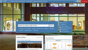
 Last month we debuted the completely overhauled UNC Libraries website at library.unc.edu. Roughly a year in the making, this is a huge step forward for the Library.
Our old site was entirely hand-maintained pages, and included over 60,000 files (HTML, CSS, images, php, etc). My jaw dropped when we uncovered that number during our initial site inventory! We slashed most of that away, and moved what was left into WordPress. Even if that was all we did, being in a content management system would help immensely whenever the next redesign comes around. But our new design is also more flexible, modern, and usable.
I’m not going to quote an exact number of how many files we have left, since it’s a falling number as we move more and more of the remnants into WordPress, but it’s in the neighborhood of 10% of what we had at the start.
This was my department’s major project for quite some time, but User Experience is far from the only unit deserving credit. Our developers and countless stakeholders who advised us made it all possible.
Some of my favorite things about the new site:
- It’s responsive! We’re still tweaking the exact trigger points, but the site reorganizes itself to work well on a desktop, tablet, or mobile browser. Here’s a screenshot of the mobile view. I’m so excited that we won’t have to maintain a whole separate mobile site anymore!
- The new Places to Study page (inspired by Stanford’s wonderful feature) lets students filter our physical locations and find what they’re looking for in a study space.
- Thanks to the Formidable plugin we have easy and powerful centralized form management. We even use it as a simple ticketing system for managing user feedback about the site.
- Our staff directory is so much more usable and detailed than the old version. Something like this doesn’t have a huge impact on our site’s overall usability, but will make a big difference for internal use.
- The big background images really show off our spaces.
- Our new hours page, while not actually part of WordPress, does a great job of displaying our many branches’ status at a given moment.
We don’t consider this a completed project by any means. We’re well into Phase II now, wrangling the pieces of content into place which proved a bit too unwieldy to be ready by launch.
I’ll admit I was skeptical about WordPress’ ability to serve as a full-fledged website CMS. While I’ve used it as a blogging platform for almost 9 years, I’d never gotten deeply into all it can offer. I was happy to be proven wrong! WordPress has proven to be a flexible and powerful platform, and I’m quite excited to keep working with it. When I think about how much more maintainable the new site is, I practically get giddy.
Our early feedback is largely positive, and we plan on doing some serious user feedback campaigns to guide our future work. Thank you to all who have worked with us on this project!
I’m sure I’ll be writing (and hopefully presenting) more about this in the near future.