I try to keep an eye out for standards in mobile UI. With limited screen space available for the interface, I spend a ton of time thinking about how best to represent actions to our users. Are there standards of how users have come to expect mobile interfaces to behave? Lately I’ve seen this one popping up in a number of places:

The box of three horizontal lines is everywhere. Not too long ago Chrome ditched their wrench icon in favor of the lines:
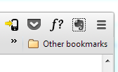
It’s also in the Facebook app (twice):
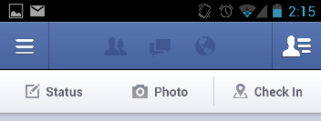
And Feedly:

And on Youtube’s desktop site:

and even on my Kindle:
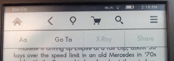
The standard for this icon seems to be that it opens a menu or navigation of some kind. Google Music’s Android app is a notable exception, where the icon opens the current playlist instead. But in the majority of cases, when users see three horizontal lines it leads to a menu.
Smashing Magazine spotted it before I did, and has a great analysis of how this icon can be used. Â Personally I think using it is a win/win. Â It makes it easier for me to design a page, and as an emerging standard helps users know what behavior to expect.