UNC Libraries’ mobile site

The summer is often my most productive time of year, especially when it comes to special projects. This summer I put my time into developing a mobile version of our website. I’m excited to announce that it went live last week, and I’m extremely happy with the results.

The mobile site is at www.lib.unc.edu/m

First, please note that it may or may not work quite right on standard desktop browsers. But take a look at it on an iPhone/iPod touch, Android phone, or Palm Pre. Any of those should work just fine, though some bits & pieces are optimized for apple’s devices. There’s also a plain text version at www.lib.unc.edu/m/plain, which any mobile device anywhere should be able to process in some fashion.

The fancier version was built with the iUI framework I mentioned previously. I’m amazed by how easy it was to develop with the framework – it really did all the heavy lifting of formatting and animation, leaving me to merely write the content.

But it wasn’t quite so easy to get what I consider the centerpiece of our mobile effort up and running: our mobile catalog. That was actually the whole reason I started a mobile site plan in the first place – I (and a number of users I informally talked to) wanted to be able to look up books while wandering the stacks. Our non-mobile catalog functions on a small mobile screen, but it was very much less than ideal and a bit tough to navigate. After exploring a few dead end avenues, I got lucky and discovered that our Endeca-based catalog has a built-in method for returning search results in XML. Using php I recrafted that XML into a mobile-appropriate page.

I’d like to particularly note that a mobile catalog would be impossible if we didn’t have Endeca as our catalog front end. III/Millennium, our underlying ILS, locks up our catalog and provides no easy way to get at the underlying data. And on a related note, while compiling a list of mobile-friendly database/article interfaces from vendors themselves I was appalled at how few exist. Ingenta, IEEE, and Refworks were the only three major ones I found. This is a plea for openness to ILS providers and other library vendors – if you’re not going to build these things yourself, please give us data-level or API access to the sources we’re paying you for. We can build some pretty cool stuff, if only you’ll let us.

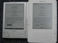
Sony Reader PRS-505 vs the Kindle 2

06/19/09

Back in June I picked up a Sony e-book reader when Borders had a sale too good to pass up. It ended up being about half the price of a Kindle (at the time – the Kindle is a bit cheaper now). I don’t regret the purchase one bit! I’ve had a bunch of hands-on experience with a Kindle 2 at work lately, and in many ways I think the PRS-505 outdoes the Kindle.

Screen contrast is comparable to the Kindle, if not slightly better. The 505 supports many more formats than the Kindle, including the one most popular to me – epub. Epub has been growing in popularity lately for authors who like to give away their work (or samples of their work) online. So there’s plenty of free content out there for me to read! It’s an open standard too, which is a nice bonus. The Kindle 2 can read epub files after a conversion, but in my experience that conversion is imperfect and introduces a number of formatting errors to the text. The 505 also reads PDFs without any conversion, which is a MAJOR boon for any researcher who finds themself awash in a pile of journal articles from library databases.

Of course, the 505 lacks one major feature of the Kindle: wireless web and book store access. The 505 requires a USB connection to a computer or memory card to add new books. I don’t miss the wireless connection though – if anything the lack of distraction helps me focus on actually reading! And considering that I saved so much money over a Kindle, I don’t mind the absence one bit.

The 505 is missing one feature that I dearly wish it had – built-in search. I can’t search through the text of a book on the 505 for some reason, which to me is a primary advantage of having text in electronic format to begin with. I can search in a book via Sony’s desktop software, then bookmark a location to load up on the reader, but that doesn’t help me when I don’t have access to a desktop PC. However, this lack bugs me less than I thought it would. In 6 weeks of frequent use, only once have I wished I could search for something. I guess the lack of this feature is because the 505 lacks the keyboard of the Kindle 2. But I still think some sort of text entry via a toggle button would have been better than none at all. Incidently Sony’s newer model, the PRS-700, adds search via a touch-screen keyboard. But I saw a 700 in a store recently, and wasn’t impressed at all. Adding a touchscreen overlay to the display makes it appear muddled and blurry.

And both readers are hobbled by official book stores which only sell books locked down with DRM. I say this a lot, but: I won’t buy any books from Amazon or Sony’s stores until I know that I can at the very least loan them to friends or donate them to a good cause when I’m done reading. Both stores’ prices are currently far too high, often equivalent to or nonsensically more than the print version, to justify the tradeoff of losing those ‘features’ of a book.

And there’s one final, less concrete reason I prefer the 505 over a Kindle 2 – the 505 doesn’t feel like it’ll fall apart in my hands. It’s made of metal, and feels much more solidly built than the plasticy Kindle. I actually dropped the 505 once, pretty severely. I had to snap the power button back on, but otherwise there was absolutely no sign of injury. I’m very confident that a similar fall would have killed off a Kindle 2.

Incidentally, check out Calibre! It’s a great piece of software designed to manage eBook collections on a reader. http://calibre.kovidgoyal.net/

Low Effort, High Impact Mobile Web Development

A little over a week ago I presented on “Low Effort, High Impact Mobile Web Development” at the Triangle Research Library Network’s annual meeting. I had a lot of fun putting it together and presenting, particularly because I got to highlight the really cool iUI framework. iUI is a nifty set of CSS and javascript files that do the heavy lifting of coding a website designed for an iphone. You get snappy animations and a nice emulation of standard iPhone navigational elements from writing little more than standard HTML list tags.

My other favorite thing about iUI is that it degrades pretty nicely into a format that’s more generic and not tailored to an iPhone – simply by removing the CSS and javascript links. So any mobile device can use it, and we don’t have to duplicate development efforts!

We’ll be using iUI to launch a mobile site for the library pretty soon, hopefully before the fall semester kicks in. I’m not sure how valuable my presentation slides are without my accompanying narration, but here it is just in case:

http://www.slideshare.net/chaefele/low-effort-high-impact-mobile-web-development